Saturday, April 30, 2011
Big Changes
This post was originally posted on Lumberjocks, an online woodworking community. Lumberjocks is the #1 social network for woodworkers.
Big Changes
My project posts have slowed to a crawl and so has my time in the shop; the last project post was over 5 months ago.
What gives?
One reason, a problem I've been encountering, is very clear to me and the second reason, which turns out to be a solution to the problem, was not so obvious and has been nagging at me all winter long.
The Problem
Woodworking plans for the style of projects I want to build are hard to find. I don't know if you experience this same problem but would be interested in seeing your comments. The style I am referring to is not really a single style, rather the era of modern design beginning in the 20th century through current day.
The Solution
Since I could not find the plans I wanted, I decided to design them myself - at first rough drawings in the shop, then with Google SketchUp (an amazing program). From there I purchased a drawing program. The design process took on a life of its own and I found myself spending more time designing than building.
The Challenge
The solution to the problem keeping me out of the shop is now keeping me out of the shop as well. But I enjoy designing as well as building. Add in interests in computers, the web, maintaining a web site and - a day job - well, you can see what has been nagging at me - how to resolve and combine these varied interests into a single manageable whole.
The Change
How to combine woodworking, plan design, computer tech, web site design into a single pursuit?
Acknowledge that design is the common denominator in this equation.
Design
Add in woodworking which was the original goal.
Design + Build
Combine with computer tech, web site design and communications.
Design + Build + Share
The New Goal
Provide unique and high quality information about modern design on the web for the woodworking community.
I have many ideas to accomplish this goal which I am excited about such as:
* Maintaining a catalog of plans and information about modern design on the web - a go to source for internet based plans.
* Reviews of my experiences in building projects from commercial plans.
* Reviews of tools, jigs etc. I have used.
* Provide high quality unique woodworking plans for purchase.
* Post plenty of free content about my own designs.
* As always I will maintain project posts on Lumberjocks, which was the original inspiration for my woodworking web presence.
I will be consolidating my website www.randallprice.com and blog http://modernhomage.blogspot.com/ into one location on a WordPress platform. I plan to use www.randallprice.com as the domain so the change should be seamless to readers.
What else would you like to see, and do you think this will offer value to you?
I welcome your comments and suggestions.
Randy
Friday, April 22, 2011
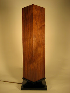
Fallingwater Lamp
A few years ago I had the opportunity to visit Frank Lloyd Wright's architectural masterpiece Fallingwater. The Kaufmann family, owners of a prosperous 1930s era Pittsburg, PA department store, commissioned Frank Lloyd Wright to build a vacation home on their property Southeast of the city. To learn more about this National Historic Landmark visit the Fallingwater web site.
Wright was well known to design not just the building, but the complete living environment for his clients, including furnishings. One of the accessories at Fallingwater which caught my attention was a bedside lamp, used in both the main house and guest house.
Over the 10 or so years since my visit to Fallingwater I have become an ardent fan of the architecture and design of Wright. By chance I discovered an article on the Popular Woodworking Magazine website entitled Fallingwater Table Lamp and I decided then and there to build one.
After comparing the Popular Woodworking version to original photos of the lamp were some differences, so I came up with my own plans, attempting to stick as close as possible to the original photos.
Fallingwater Bedside Lamp Plans
(To download plans, right click and select Save Link As...)
The shade sides are walnut – I used a single wide piece of walnut and mitered it at the center of the flame pattern in the walnut so it wraps around the shade. The shade base is poplar painted black and I used small biscuits to attach the shade sides to the shade base. The lamp base is of the same poplar painted black.
Here are the differences between the Popular Woodworking (PW) plan and what I built:
The walnut shade on the PW plan is 2 pieces mitered giving a 2 sided “L” shape. The original had 4 pieces mitered so there are 2 more shorter “wing” pieces on the shade with the shade having 4 sides. Here is a view from the top:
The PW plan has the lamp shade base attached inside the shade sides so it is not visible from the front. The shade base is square. On the original the shade side sat on top of the shade base with the base extending about 3/16” beyond the shade sides. The original base is not square and has a more complicated shape:
The profile of the lamp base on the PW plan is thicker and more “blocky” looking where the original has a thinner profile:
One last modification I made was to add a heat shield/reflector. Neither the original nor the PW version had a heat shield.
I made the heat shield out of aluminum flashing from the home center. I used some small wood screws and washers to space the reflector out about 1/4” from the shade.
I cut the aluminum with a utility knife and straightedge.
I marked and taped where I wanted to make the bends. I clamped thin pieces of wood to both sides of the aluminum, placed the aluminum on the edge of the work bench and bent it.
The bend wasn’t real crisp so I took a piece of wood and “creased” the bend which did the trick.
Here’s an end view of the shield.
I made a template to mark where I wanted to put the screws. I put a 1/4” spacer behind the shade and marked the points to drill with an awl.
Here’s a picture with the spacer sticking out the end.
I wanted to make sure I didn’t screw through the shade so I did a mock up with a piece of wood the same thickness of the shade.
Here’s the shield screwed in place. I had to remove the light socket and base to install the shield.
An end view showing the air space.
A picture with the lamp on. It reflects much more light now. Before the wood shade got pretty warm where the bulb was, now it stays cool.
The finished lamp:
Subscribe to:
Posts (Atom)